










































Crypto enthusiast turns Bitcoin chart into “battlefield”
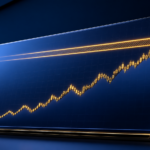
A crypto enthusiast has launched a website that turns Bitcoin’s one-second chart into a “battlefield” visualization. Strange idea? Sure. But crypto has always had room for strange ideas. I’ll be honest: this feels less random than it first sounds, because traders already describe buyers and sellers like two sides pressing into each other. A BTC price tick becoming a fight scene is not a huge leap from the way people talk about the market in live chats.
The site, which can be viewed here (link provided in source), takes BTC’s second-by-second price moves and turns them into a moving visual scene. No candlesticks. No plain line chart. No quiet little squiggle pretending the market is calm. Users watch the fight shift as the price moves. Yes, it sounds gimmicky. It probably is. Most market tools try to look serious. That’s only half right: sometimes the ridiculous-looking one captures the mood better.
The psychology is the useful bit. A normal chart asks the user to read patterns and compare levels. It also assumes the user knows what the candles mean. This version turns that pressure into a picture. Buyers push. Sellers push back. The price moves, and the “battle” changes with it. Why does this matter? Because someone new to crypto may understand pressure faster from a moving scene than from an order book packed with numbers. My take: I would not call it analysis. I can see why someone might keep watching it, though.
It may also change how people read the market in the moment. If the screen looks frantic, BTC may feel even more volatile than it is. If the battlefield goes quiet, users may treat that as a pause before the next move. Counter to the usual advice, the problem is not only that visuals can oversimplify. The sharper risk is that they can make a trader feel like something is happening before anything useful has happened. The tool does not predict anything. It probably does not even try. Still, short term crypto trading is already emotional and twitchy, and a one-second visual feed leans straight into that feeling.
What this means
The site points to a more visual style of crypto data: less clean charting, more gut reaction. That is not automatically bad. We have seen traders use far weaker cues than a live BTC visualization, and at least this one is honest about being dramatic. Retail traders may use tools like this for a quick read on pressure during sharp BTC moves. Is this overkill? For slow markets, probably. During a fast BTC move, maybe not. Crypto traders have never needed much permission to use unusual signals.
The thing to watch is whether other crypto sites copy the idea. If it catches on, platforms may add more game-like market views, especially for high volume assets like Bitcoin. Yes, this contradicts the usual “keep charts clean” mantra; bear with me. Clean charts help when someone is making a decision. Messier visual feeds may win when someone is just trying to feel the tape. I would also watch how people behave near big round numbers. If BTC is fighting around a level like $100,000, a dramatic visual “battle” could make some traders react faster than they would from a standard chart.